Overview
Design systems are providing precise information about individual components. Maintain consistency for entire application interfaces. We can think of a design system as a vast data library that acts as a valuable document with applicable instructions and examples, style guides and coding guidelines, and a part of the UI kit all at the same time.
- Focus on consistency
- Color palette
- Icons style
- Typography
I am a member of Syncron's central core design team. We are building a design system framework that provides standardized components for all company products. This ensures consistency and improves the brand's value.
My approach
- We mainly follow Angular Material, M2, and M3 guidelines for web and Android, and Human Interface Guidelines for iOS.
- Design Tokens: Variables for core styles like colors, fonts, and shadows, used across platforms.
- We adjust these standards later to fit our product needs and brand style.
Our everyday tasks
- Building new components and updating existing one
- Maintain Figma libraries
- Created detailed specifications for each component for developers
- Collaborated with all design teams to define consistent patterns.
- Internal reviews and presented to entire team after publishing it.
- Plan workshops or community syncs for major challenges
- We are documenting all components in ZeroHeight so everyone in the company can access and view them.
Case study
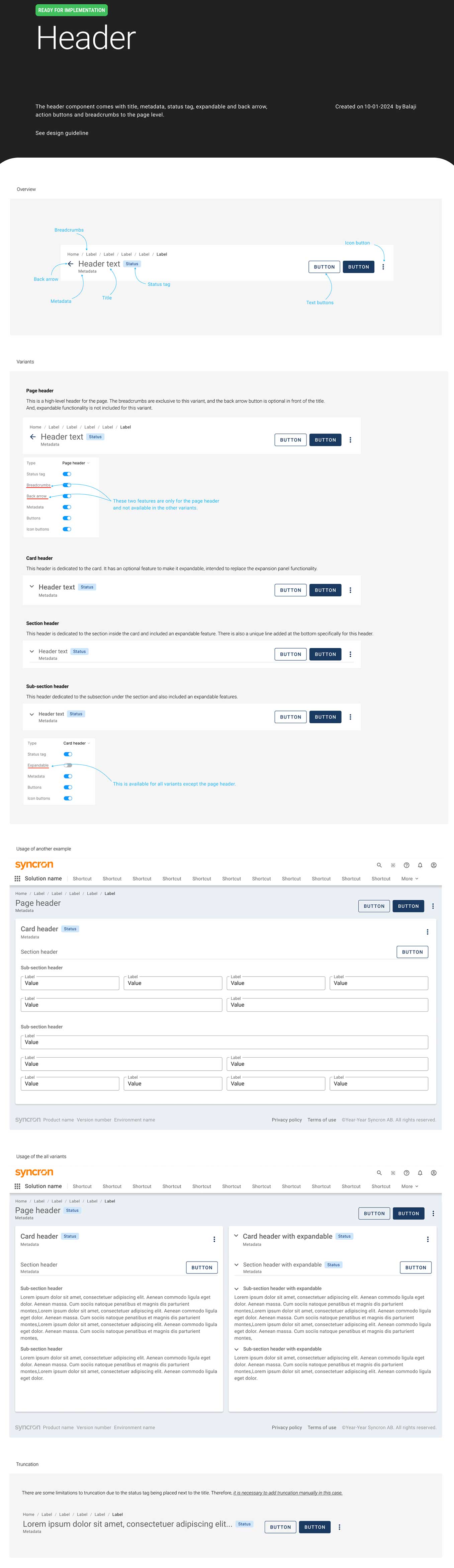
I shared a case study about solving a custom header design component in the Flame design system at Syncron.
Problem
Each designer is using different font sizes and styles for titles. It needs to be streamlined based on all product requirements. It seems simple but need to careful and it creates big impact on across all products.
Research
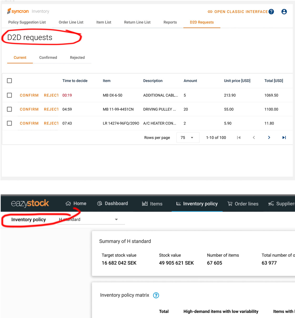
- Had a conversation with all product designers. (Price, Inventory, easystock, SFM etc..)
- Identified the issues and observed the patterns how they are using in their products
- Validate material design guidelines and text styles
- Asked about product specific reauirements. Few new elements required it's metadata, action items, expandable, breadcrumbs, status tag.
Conclusion
We decided to create a header component based on inputs from all product designers. The component includes the following features:
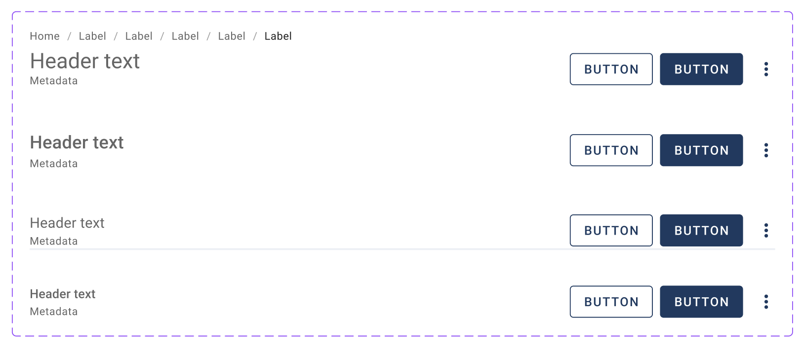
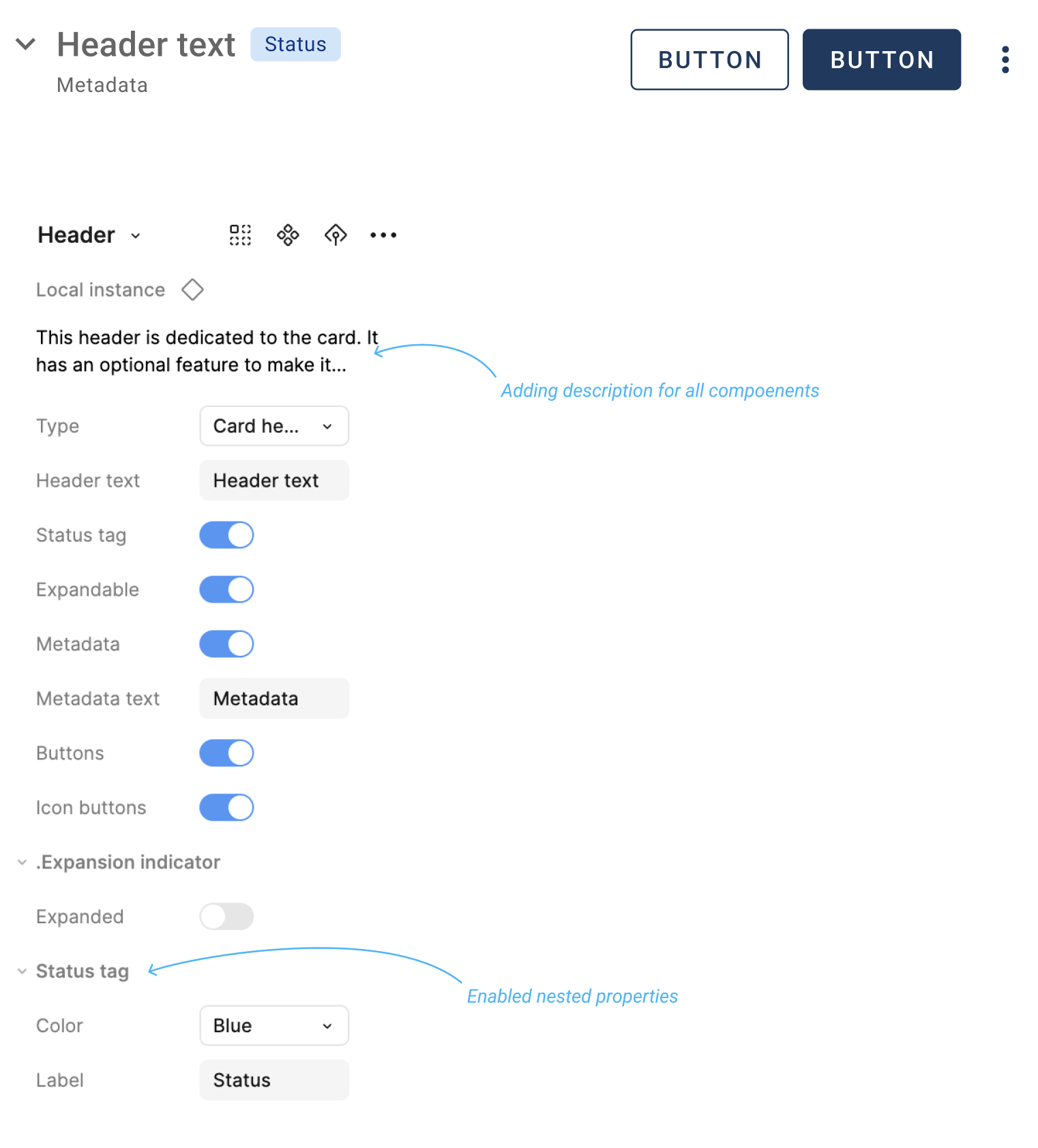
- Variants: The header has four variants—Page Header, Card Header, Section Header, and Sub-section Header. Only the Section Header includes an underline, distinguishing it from the Sub-section Header.
- Breadcrumbs: Available exclusively in the Page Header variant.
- Status Tag: Positioned next to the header text.
- Expandable Functionality: Includes a collapsible arrow icon in front of the header text, hidden by default.
- Buttons: Includes buttons and icon buttons aligned to the right.
- Metadata: Displayed below the header text.
Here is the header component, one of the key elements in the Flame library.
Here are the properties of the header component.
Header specifications